


Design & Marketing · June 2026 · 8 min read
Introduction
Ask most non-Japanese marketers to picture a Japanese colour scheme and you tend to get the same answer: red, white, black, and perhaps a little grey. The red and white come from the national flag, while the black and grey feel “Zen” or vaguely ninja-like. It is a reasonable guess, but it captures only a sliver of the real picture. The authentic Japanese colour palette is far broader, softer, and more seasonal than that stereotype suggests.
For any company promoting a product, a service, or an event connected to Japan, this gap matters. Colour is the first thing an audience processes, long before they read a single word. When your visuals lean on the same three or four predictable tones, you signal a surface-level understanding of the market. When you reach for the right seasonal Japanese colour palette, you signal genuine cultural fluency, and that perception does real commercial work.
This article introduces a free Seasonal Colour Explorer app that opens up the wider world of Japanese seasonal colour. We will explain where these colours come from historically, show you how the tool works, and outline exactly who benefits from using it. You can try the live app below before reading on.
Table of Contents
Why the Japanese Colour Palette Is More Than Red and White
The red-white-black shorthand is not wrong, but it is incomplete in a way that costs marketers credibility. Those tones belong to a narrow slice of Japanese visual culture: the flag, formal ceremony, and the high-contrast graphic style of modern advertising. They say very little about how Japanese people have actually experienced and named colour across centuries of daily life.
Traditional Japanese colour culture is organised around nature and the seasons. The vocabulary is enormous, with hundreds of named hues tied to specific plants, foods, weather, and moments in the year. A soft plum-blossom pink in early spring, a deep indigo associated with summer cloth, the rust and gold of autumn maples, the muted greys of midwinter — each carries an emotional and seasonal association that a Japanese audience reads instantly.
Why This Matters Commercially
Research into cross-cultural marketing consistently finds that colour shapes brand perception and purchase intent more quickly than copy does. A campaign that uses a seasonally appropriate Japanese colour palette feels native and considered. One that defaults to flag-red and black can read as generic or, worse, as a foreign company guessing. The difference is not decoration; it is positioning.
The Red-White-Black Stereotype
- Same three or four predictable tones everywhere
- No connection to season, place, or occasion
- Reads as a foreign guess at “Japanese-ness”
- Blends in with every other generic campaign
A Seasonal Japanese Colour Palette
- Hundreds of named, nature-rooted hues to draw on
- Colour matched to season, mood, and message
- Reads as culturally fluent and intentional
- Stands apart from competitors using clichés
Where the Japanese Colour Palette Comes From
To use the colours well, it helps to know where they came from. Japan’s rich colour vocabulary developed mainly during two long stretches of peace, when court life and city culture had the stability to refine aesthetic taste.
The first was the Heian era (late 8th to late 12th century). Aristocrats at the imperial court developed an elaborate culture of layered colour, most famously in the way garments were combined so that seasonal hues showed at the sleeve and hem. The second was the Edo era (17th to 19th century), when a prosperous merchant class drove demand for textiles, woodblock prints, and fashion, multiplying the named colours of everyday life.
Heian Era · late 8th–late 12th c.
Court aristocrats refined layered seasonal colour in dress and poetry, establishing the idea that each hue belongs to a moment in the year.
Edo Era · 17th–19th c.
A thriving merchant culture spread colour through textiles, fashion, and woodblock prints, expanding the everyday Japanese colour palette enormously.
Underpinning all of this was the calendar. According to the National Diet Library, Japan adopted a lunisolar calendar transmitted from China in the 7th century. It divided the year into 24 segments known as the Nijushi-Sekki, or Twenty-Four Solar Terms, and this system remained in official use until 1872. Each term marks a subtle shift in the season, and many traditional colours are tied to these moments. The Seasonal Colour Explorer is built directly on this 24-term structure.
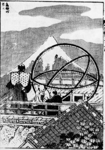
Katsushika Hokusai, Fugaku Hyakkei vol. 3, Unsodo, 1948. National Diet Library Digital Collections, dl.ndl.go.jp/pid/1068939 (accessed 2026-06-30).
What the Seasonal Colour Explorer App Does
The Seasonal Colour Explorer turns this tradition into a tool you can actually use. It is a simple, free web app that reveals a curated Japanese colour palette for each point in the traditional year, giving you instant inspiration drawn from Japanese scenery, food, and culture.
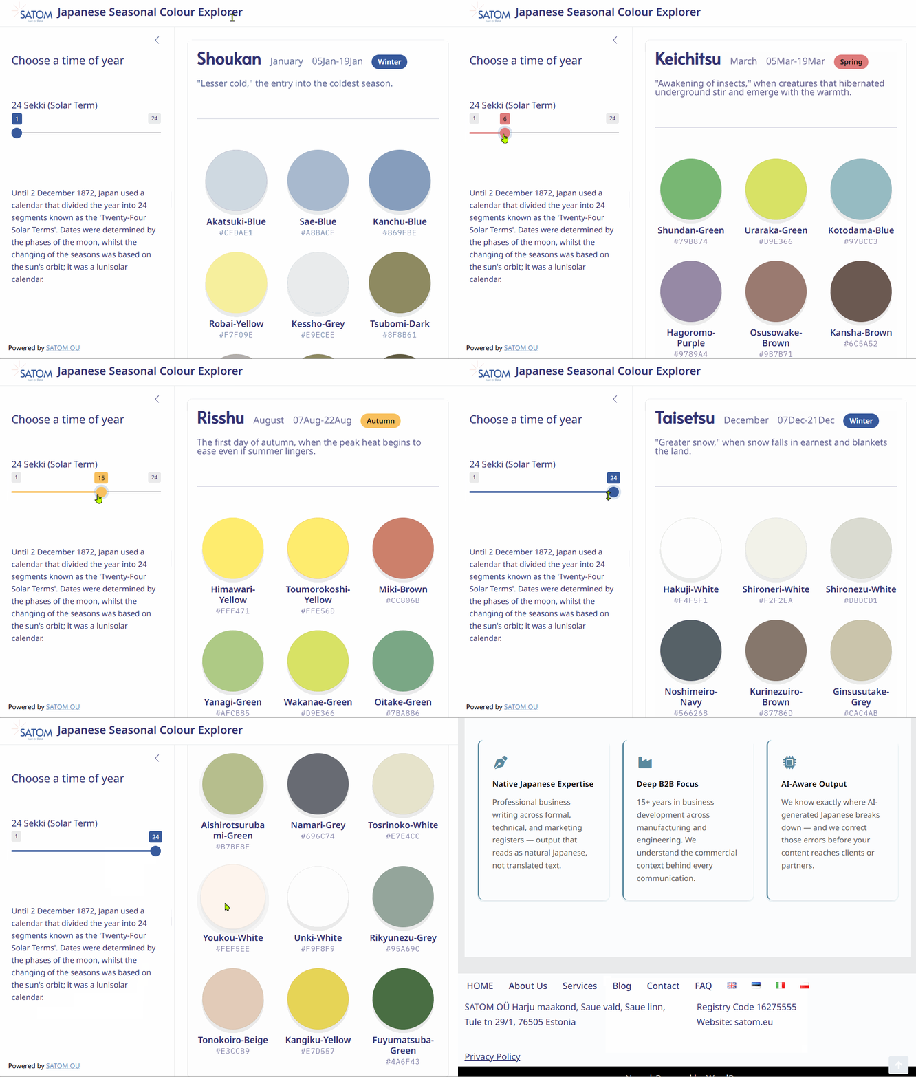
What the Japanese Colour Palette Explorer Offers
- Season-by-season palettes: A distinct set of colours for each of the Twenty-Four Solar Terms
- Named colours with hex codes: Every swatch shows its traditional name and exact hex value for direct use in design
- A live season icon: A round indicator shifts colour as you move through the year, anchoring each palette to its moment
- Cultural context: Brief notes connect the palette to the season, its weather, and its associations
- Instant inspiration: No login, no software, no design experience required
In short, the app does the cultural research for you. Instead of guessing what “feels Japanese,” you can pull an authentic, season-specific Japanese colour palette in seconds and carry the hex codes straight into your own work.
How to Use the Japanese Colour Palette Explorer
Using the explorer takes only a few seconds. The whole experience is built around a single slider, so there is nothing to learn. Here is the workflow from start to finish:

①
Open the App
Launch the explorer in your browser. There is nothing to install and no account to create.
②
Move the Slider
Click and drag the slider to a time of year. Each position maps to one of the Twenty-Four Solar Terms.
③
Watch It Update
The round season icon and the full palette change to match the chosen season, all in real time.
④
Read the Palette
See the seasonal palette with each colour’s traditional name and its hex code ready to copy.
⑤
Use the Colours
Drop the hex codes into your design, deck, packaging, or web project with confidence.
That is the entire process. The simplicity is deliberate: the explorer removes the research barrier so you can spend your energy on the design itself, with an authentic Japanese colour palette already in hand.
Who the Tool Is For
The explorer is aimed squarely at people who need to present something Japanese to a non-Japanese audience, or to present a non-Japanese product within a Japan-themed context. If that describes your work, a credible Japanese colour palette is one of the fastest ways to lift the quality of your output.
Designers
Anyone designing for a Japanese theme who wants colour choices grounded in real tradition rather than guesswork or clichés.
Marketers
Teams promoting a Japanese product or service abroad who need visuals that feel authentic to local Japanese taste.
Event Organisers
Anyone running a Japan-related event in their own country who wants signage, invitations, and branding that ring true.
Putting the Japanese Colour Palette to Work
Once you have a seasonal palette in hand, the applications are wide. A spring palette of plum and pale green can frame a product launch; an autumn palette of rust and gold can warm a seasonal campaign; a winter palette of cool greys and deep blue can lend quiet sophistication to a premium brand. The same tool serves packaging, slide decks, social graphics, and physical event spaces equally well.
Getting the Most From a Seasonal Palette
Match the Season to the Message
Align your palette with the season your campaign runs in, or with the mood you want to evoke. The seasonal logic is the source of the authenticity.
Let One or Two Colours Lead
A full nine-colour set is a source, not a rule. Choose a small dominant pair and use the rest as accents to keep the design disciplined.
Respect Negative Space
Traditional Japanese design values restraint. Surrounding a seasonal palette with generous whitespace makes the colours read as elegant rather than busy.
Colour, of course, is one layer of a larger market-entry picture. If you are presenting to Japanese buyers or building campaigns for the Japanese market, it pays to align your visuals with the right messaging and format. Our guides on essential presentation tips for Japan and the five critical things to prepare before launch cover the surrounding strategy, while our Japanese font generator article pairs naturally with this palette tool on the typography side. You can also read about the costly mistakes companies make when they skip this groundwork.
Need a Hand With the Japanese Market?
The Seasonal Colour Explorer is free for anyone to use. If you need to go further and want hands-on support taking your product, service, or event into the Japanese market, SATOM can help.
KEY TAKEAWAYS
Key Takeaways
- Look past the stereotype: The real Japanese colour palette is far wider than red, white, black, and grey.
- It is seasonal at heart: Traditional colours map to the year, rooted in the Heian and Edo eras and the Twenty-Four Solar Terms.
- The explorer does the research: Drag a slider and get an authentic seasonal palette with names and hex codes in seconds.
- Built for designers and marketers: Ideal for promoting Japanese products abroad or running Japan-themed events at home.
- Pair colour with strategy: Combine the palette with sound presentation and localization for the strongest impression.
A more authentic Japanese colour palette is one of the simplest ways to show an audience that you understand Japan beyond the obvious. Open the Seasonal Colour Explorer, drag the slider through a year of colour, and bring a little of that depth into your next project.
Related Articles
Japan Market Entry
Japan Market Entry
Further Reading and Sources
- National Diet Library — The Japanese Calendar — History of the lunisolar calendar and the Twenty-Four Solar Terms behind the seasonal palette
- NDL Digital Collections — Hokusai, Fugaku Hyakkei — Source of the Edo-era woodblock print shown above
- The Met — Art of the Edo Period — Background on the era that expanded everyday Japanese colour culture
- JETRO — Japan External Trade Organization — Official guidance for companies entering the Japanese market