


Design & Marketing · June 2026 · 9 min read
Introduction
When non-Japanese companies exhibit at B2B trade shows in Japan or launch marketing campaigns targeting Japanese audiences, every design detail signals something about your commitment to the market. Yet many exhibitors and advertisers overlook a fundamental reality: the fonts they choose communicate as much as their words. A poorly selected font — or worse, a generic business typeface applied without thought — tells Japanese viewers that your company did not invest enough care in reaching them.
Thanks to advances in translation technology, companies can now produce technically correct Japanese copy relatively easily. But translation is just the beginning. High-end products and services deserve high-end presentation. When your materials use uninspired typography, the disconnect between quality and appearance can be the reason why a promising product fails to gain traction in the Japanese market — not because of the translation, but because of the design.
This article explores how to use a Japanese font generator to create professional, culturally appropriate visual materials for Japanese audiences. We’ll walk through the typography options available, show you a practical tool for exploring Japanese fonts, and explain how intentional font selection can transform your market entry from ordinary to memorable.
Table of Contents
Why Japanese Typography Matters for Your Brand
Typography is not merely about readability. In Japanese business culture, font selection carries immediate cultural and aesthetic meaning. The typeface you choose communicates your brand’s values, positioning, and respect for your audience — sometimes before a single word is read.
When international companies apply generic business fonts to their Japanese marketing materials, they inadvertently send a message: “We prioritised speed and cost over respect for this market.” This disconnect is often invisible to non-Japanese teams, but it registers immediately with Japanese viewers — and it can be the deciding factor when a buyer evaluates competing suppliers.
Real-World Pattern
A technology company exhibited at a Tokyo trade show with bilingual materials. The English side was polished and professional. The Japanese side used the same generic sans-serif throughout. At the booth, Japanese visitors lingered with the English materials — not to read the English, but because the visual presentation signalled a different level of care. The product itself was the same; the typography told a different story.
A Japanese font generator allows you to explore the variety of typefaces available, understand their aesthetic meaning, and make informed decisions before committing to expensive print runs or exhibition materials.
Without Intentional Font Selection
- Generic, uninspired typeface choices
- Same font used for all contexts (wrong register)
- Visual presentation does not match product quality
- Materials blend in with dozens of other exhibitors
With a Japanese Font Generator
- Thoughtful, culturally appropriate font choices
- Different fonts selected for headlines vs. body text
- Visual presentation reinforces brand positioning
- Materials signal attention to detail and market respect
Understanding Japanese Font Categories
Japanese typefaces fall into distinct categories, each with its own aesthetic personality and appropriate applications. Understanding these differences is the foundation of using a Japanese font generator effectively.
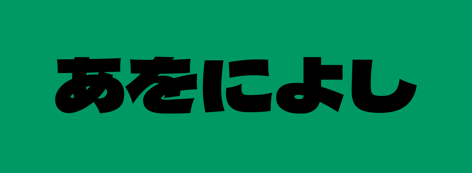
Display Fonts
ディスプレイ体
Bold, eye-catching headlines. Used for exhibition banners, posters, and promotional materials. Conveys energy and modernity.
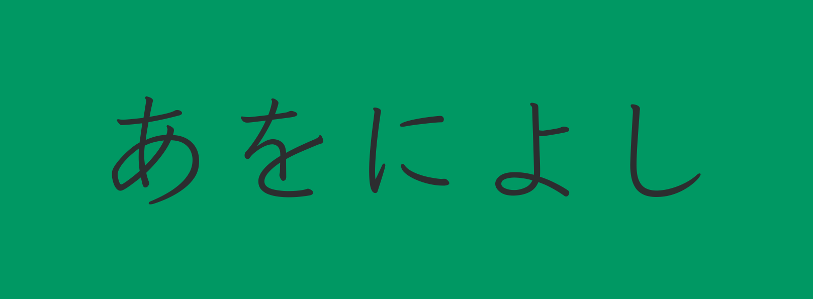
Handwriting Fonts
手書き体
Personal and creative aesthetics. Best for creative portfolios, invitations, and brands emphasising artisanal qualities.
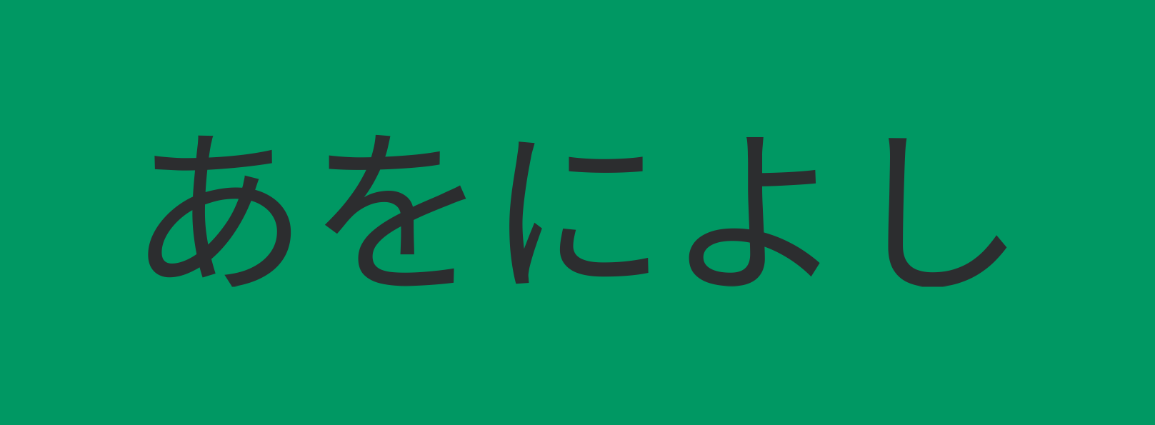
Sans-Serif Fonts
ゴシック体
Clean and professional. Perfect for business documents, presentations, and materials requiring high legibility.
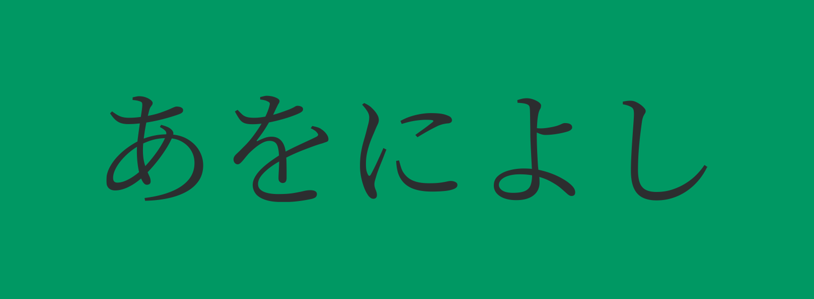
Serif Fonts
明朝体
Traditional and elegant. Conveys stability, heritage, and refinement — ideal for luxury brands and cultural institutions.
When you use a Japanese font generator that organises fonts by category, you can quickly narrow your choices to the aesthetic that matches your brand positioning. This is the fastest way to move from “I need a Japanese font” to “This is the right font for my message.”
The Japanese Font Generator Tool
We have developed a specialised Japanese font generator specifically for marketing professionals and design teams who need to create professional-grade Japanese-language content without requiring deep typography expertise or expensive design software.
Key Features of the Japanese Font Generator
- Smart Font Filtering: Browse fonts by category — Display, Handwriting, Sans-Serif, Serif
- Font Characteristics Display: Each font shows its purpose, aesthetic impression, and recommended use cases
- Real-Time Preview: Generate your Japanese text instantly in any available Google Font
- Multiple Export Formats: Download your design as SVG (scalable vector) or PNG (raster image)
- Full Customization: Adjust font sizes, text colours, and background colours using hex codes
- Multilingual Interface: Available in English and Italian
- Integration with Professional Services: Direct links to proofreading and localization services when you need expert support
The tool is built around the principle that good design should not be expensive or complicated. Your job is to understand what your brand needs to communicate. The Japanese font generator handles the typography exploration.
How to Use a Japanese Font Generator Effectively
Getting the most from a Japanese font generator is straightforward once you understand the workflow. Here are the five essential steps:
①
Define Your Design Goal
Before exploring fonts, clarify your specific need. Are you creating a corporate presentation slide? A promotional poster? A website banner? Your goal determines which font category will work best.
②
Choose Your Font Category
Use the filter to narrow down to your category. For business presentations, sans-serif fonts typically project professionalism and clarity. For posters, display fonts command attention.
③
Preview with Your Content
Enter your actual Japanese text (up to 28 characters) to see exactly how it will appear. This matters — what looks good as a sample may not work well with your specific character combinations.
④
Test Multiple Colours
The colour you pair with your chosen font dramatically impacts the impression. Use the customisation features to test hex colour codes that align with your brand guidelines.
⑤
Export and Implement
Download in SVG format for scalability across all media, or PNG for immediate use in presentations and social media.
This workflow keeps you focused on design decisions rather than technical complexity. The Japanese font generator handles the rest.
Design Tips for Japanese Marketing Materials
Understanding fonts is one part of the equation. Using them effectively is another. Here are the key principles that separate professional Japanese marketing materials from amateur efforts:
Design Principles for Japanese Marketing
Respect Whitespace
Japanese design philosophy values negative space. Effective materials use strategic whitespace to guide the viewer’s eye and create elegance — not to fill every pixel.
Size Matters More Than You Think
Japanese characters are visually denser than Latin letters. What seems “too large” in English may be exactly right in Japanese. Always test sizes with your actual content.
Balance Latin and Japanese Text
If your design includes both English and Japanese, ensure they harmonize visually. This requires selecting fonts that work well together typographically.
Prioritise Legibility in Business Contexts
For B2B exhibitions and corporate presentations, legibility takes precedence over creative experimentation. Choose fonts that remain clear even when viewed from a distance.
Real-World Applications for Your Team
A Japanese font generator is most useful when your team actually uses it. Here are the immediate contexts where it saves time and improves quality:
Exhibition Booth Panels
Create eye-catching booth titles and product descriptions. A properly selected font transforms a simple booth into a memorable brand experience that stands out from competitors.
Presentation Slides
Elevate B2B presentations with professional Japanese typography. This investment signals respect for your audience and confidence in your offering.
Digital Marketing
Website banners, social media graphics, and email headers all benefit from intentional font selection. Ensures consistency across your digital presence.
Product Packaging
Test font options before committing to expensive packaging production. Appropriate typography significantly influences purchasing decisions in retail environments.
Combining Fonts with Professional Localization
While a Japanese font generator solves the visual design challenge, comprehensive market entry requires additional expertise. Translation quality, cultural adaptation, and context are equally important.
If you are serious about reaching Japanese audiences, pair your font design work with professional localization services. Learn more about Japan market entry strategies and explore specialised support like Japan market entry presentations to ensure your entire marketing approach resonates with your target audience.
Fonts + Professional Content = Market Success
- Professional Proofreading: Ensures your Japanese text is not just translated, but culturally adapted and business-appropriate
- Typography Consultation: Specialists can recommend font choices that match your industry and audience expectations
- Context-Aware Content: Subtle wording changes can significantly improve how your message lands — and the right font reinforces that message
- Consistent Brand Presence: From content strategy to visual design, every element works together
KEY TAKEAWAYS
Key Takeaways
- Typography signals brand commitment: Font selection tells Japanese viewers whether you invested in the market or took shortcuts.
- Understand font categories: Display, Handwriting, Sans-Serif, and Serif fonts each communicate different messages and suit different contexts.
- Use a Japanese font generator: Explore options, test with your actual content, and make informed decisions before committing to expensive materials.
- Combine fonts with localization: Professional Japanese content paired with appropriate typography creates the strongest market impression.
- Test before production: Your investment in design exploration saves money on failed print runs and ineffective exhibition materials.
Japan is a market where the quality of your preparation is visible long before any contract is signed. A Japanese font generator is a simple tool that delivers immediate, measurable value. Start exploring your options today.
Related Articles
Japan Market Entry
Japan Market Entry
Further Reading and Sources
- Google Fonts — Japanese Language Typefaces — Free, open-source fonts with full Japanese character support for professional use
- JETRO — Japan External Trade Organization — Official market entry guidance, sector data, and investment support
- Hofstede Insights — Japan Country Profile — Cultural dimension analysis informing communication patterns in Japanese business
- Wikipedia — Japanese Writing Systems — Overview of hiragana, katakana, and kanji in professional communication contexts