


The final installment of our operational data business case series
Visual documentation that accelerates purchase decisions is the missing link in most B2B sales processes. Furthermore, this challenge becomes even more critical in today’s fast-paced business environment. Therefore, this final article reveals how to transform analytical insights into effective visual documentation that drives decisions and delivers measurable results.
Table of Contents
Table of Contents
The Visual Communication Challenge
Executives process information quickly, yet they face an overwhelming amount of data daily. Consequently, dense spreadsheets and technical reports get delayed, delegated, or ignored entirely. Moreover, in today’s competitive marketplace, effective visual documentation must communicate complex financial benefits at a glance. Research from the Harvard Business Review on data visualisation confirms that visual formats dramatically improve comprehension speed and decision confidence. Thus, the ability to present information visually becomes a crucial differentiator between successful and unsuccessful proposals.

Essential Visual Elements
Investment Recovery Visualisation
First and foremost, strong visual documentation transforms payback calculations into clear visual stories that resonate with decision-makers. For instance, our automotive analysis showed cumulative savings crossing the investment threshold within 12 months, with benefits accelerating over time. Additionally, these visual documentation elements help stakeholders understand the timeline and magnitude of returns, making the investment decision more tangible and compelling. Learn how we built the underlying data model in our first article on operational data collection.
Performance Comparison Tables
Subsequently, present before-and-after scenarios with specific metrics that demonstrate clear value. A well-structured visual documentation table allows executives to absorb complex comparisons instantly:
| Performance Area | Current State | Proposed State | Annual Impact |
|---|---|---|---|
| Defect Ratio | 2.86% | 1.4% | €265,200 savings |
| Production Downtime | 48 hrs/year | 12 hrs/year | €18,000 savings |
| Labour Requirements | Manual rework | Automated process | €33,150 savings |
Furthermore, these visual documentation comparison tables allow executives to quickly grasp operational improvements and their corresponding financial benefits. As a result, stakeholders can make more informed decisions based on concrete data rather than abstract promises.
Savings Breakdown Analysis
In addition to comparison tables, categorise benefits to demonstrate comprehensive impact. This layer of visual documentation covers multiple operational areas:
Defect Cost Reduction: €795,600 over 3 years
Labour Savings: €99,450 in operational efficiency
Production Impact: €54,000 from reduced downtime
Operational Optimisation: €7,560 in process improvements
Consequently, this breakdown approach within your visual documentation helps stakeholders understand that the investment delivers value across multiple dimensions, not just a single area of improvement.
The Executive Summary Formula
Key Financial Results (Most Important):
Above all, lead your visual documentation with the most impactful financial metrics:
- €1.1M total savings over 3 years
- 836.8% return on investment
- 1-year payback period
Quality Impact (Supporting Evidence):
Next, provide supporting evidence that validates the financial projections in your visual documentation:
- 1.46% defect ratio reduction
- 5,304 units saved annually
- 85% dust suppression efficiency
Business Drivers (Strategic Context):
Finally, position the investment within broader strategic objectives. According to McKinsey’s B2B sales research, buyers who receive clear visual documentation of ROI are significantly more likely to accelerate their purchase decision.
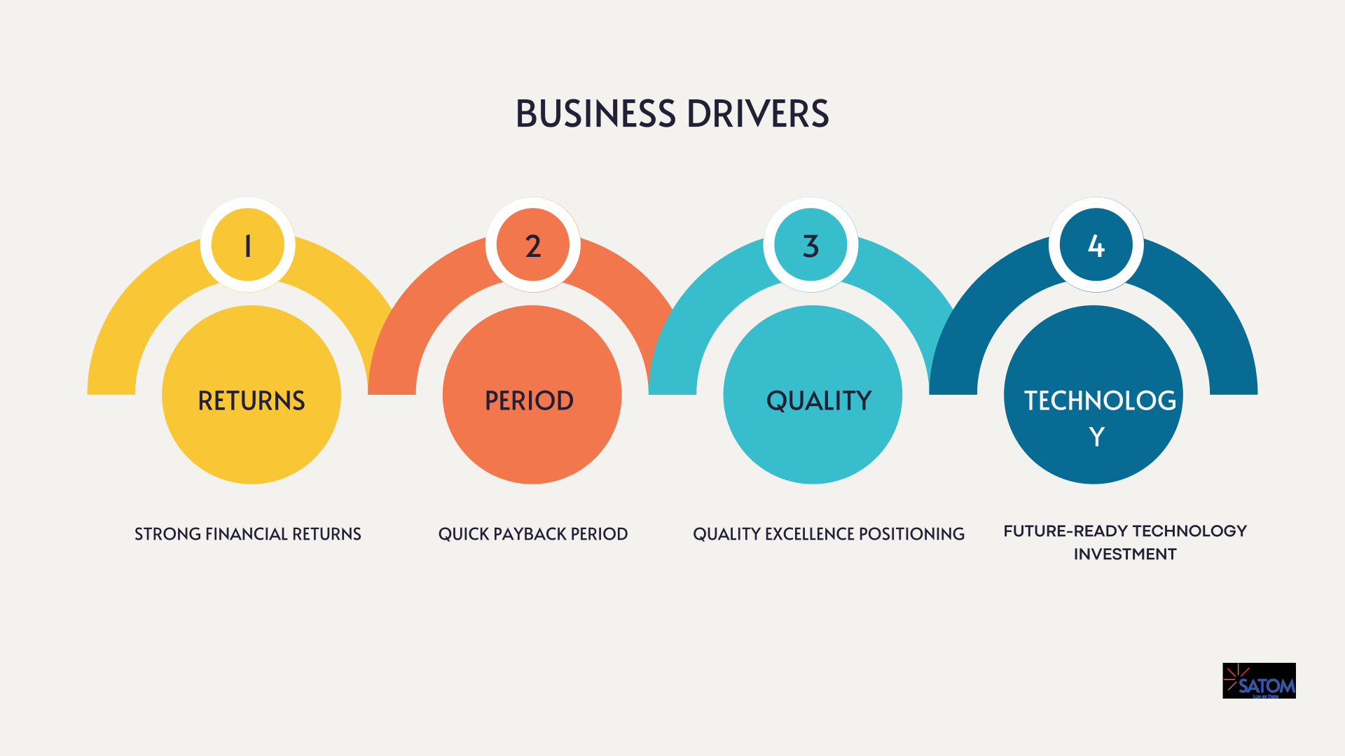
Therefore, this layered approach in your visual documentation ensures that different stakeholder groups find relevant information while maintaining focus on the most compelling benefits.
Documentation Standards
Professional Presentation:
To ensure maximum impact, maintain consistent standards throughout your visual documentation:
- Clear visual hierarchy and professional design
- Consistent formatting and terminology
- Comprehensive supporting data and calculations
Moreover, professional visual documentation demonstrates attention to detail and builds confidence in your analysis. Additionally, it shows respect for your audience’s time and decision-making process.
Audience-Appropriate Information:
Furthermore, tailor your visual documentation to address specific stakeholder needs:
- Technical teams: Implementation details and operational improvements
- Financial stakeholders: ROI analysis and cost breakdowns
- Executive leadership: Strategic benefits and competitive advantages
As a result, each audience receives the most relevant layer of your visual documentation, increasing the likelihood of buy-in across all decision-makers. See how we structured the underlying ROI analysis in our second article on financial modelling for equipment sales.
The Decision Acceleration Framework
Immediate Actions:
First, clearly outline the immediate benefits that stakeholders can expect from acting on your visual documentation:
- Secure defect reduction and cost savings
- Position for future quality requirements
- Demonstrate operational excellence
- Enhance overall performance and reliability
Risk Mitigation:
Additionally, address potential concerns proactively within your visual documentation to build confidence:
- Extended warranty coverage
- Proven technology track record
- Quality assurance standards
- Cost protection benefits
Consequently, this dual approach of highlighting benefits while addressing risks in your visual documentation creates a balanced perspective that facilitates faster decision-making.
Measuring Documentation Effectiveness
Engagement Metrics:
To continuously improve your visual documentation approach, track how stakeholders interact with it:
- Time spent reviewing documentation
- Sections receiving most attention
- Questions generated during presentations
Decision Velocity:
Furthermore, measure the impact your visual documentation has on the decision-making process itself:
- Shortened sales cycles
- Faster stakeholder alignment
- Reduced negotiation cycles
Conversion Rates:
Finally, evaluate the ultimate effectiveness of your visual documentation:
- Proposal acceptance rates
- Implementation success rates
- Client satisfaction scores
Therefore, these metrics provide valuable feedback for refining your visual documentation approach and improving future presentations.
The Transformation Result
The automotive paint line project demonstrates how sophisticated visual documentation transforms equipment sales from product-focused conversations to strategic business discussions. Moreover, by converting operational metrics into compelling financial narratives through structured visual documentation, a €131,200 investment became a €1.1M opportunity. Additionally, this transformation shows how effective visual documentation can elevate the entire sales conversation and position your solution as a strategic business investment rather than just another equipment purchase.
Key Success Factors
To achieve similar results with your visual documentation, focus on these 7 critical elements:
Accurate Baseline Data: Include all relevant expenses, not just obvious ones
Realistic Projections: Base improvements on verified performance data
Stakeholder Alignment: Involve operations, finance, and quality teams
Ongoing Monitoring: Track actual performance against projections
Clear Visual Hierarchy: Structure your visual documentation so the most important numbers are seen first
Audience Segmentation: Tailor each layer of visual documentation to the reader’s role
Iterative Refinement: Use engagement metrics to improve your visual documentation over time
Furthermore, these factors work together to create a comprehensive visual documentation approach that builds trust and delivers measurable results. Consequently, following these guidelines significantly increases your chances of success.
Conclusion
This three-part series has shown how visual documentation transforms equipment sales by speaking the language of business decision-makers: measurable outcomes, financial impact, and strategic value. Moreover, when technical specifications become operational improvements, and operational improvements become financial benefits, visual documentation becomes a powerful catalyst for business growth.
The key insight is that every industrial operation contains valuable data waiting to be transformed into compelling visual documentation. However, the challenge isn’t finding the data — it’s knowing how to analyse, present, and position it for maximum impact. Therefore, mastering these visual documentation techniques becomes essential for sales success in today’s competitive marketplace.
Finally, transform your sales approach with visual documentation that converts technical capabilities into business opportunities. Contact us to discover how comprehensive analysis can accelerate your equipment sales and improve client outcomes.
References
Cognitive Load Theory (John Sweller): Cognitive Load Theory in Sales
Visual Communication Theory: The Use of Visualization in the Communication of Business Strategies